The psychology of colors
By Mishari TamaraColor is a universal language that can be used to communicate different emotions, cultures, values and ideas. Colors are all around us. Everyday we are surrounded by many different colors.Whether we realized or not the colors have important impact on our behaviors, emotions, design decision making and user experience.
What is color psychology?
Color psychology is a well known but less explored branch of psychological study of how our brain perceives the influence of colors on our mood and behavior. Our mind reacts in colors while we usually don’t understand it. The moment when our eyes see a color, they connect with our brain and it gives signals to the endocrine system releasing hormones responsible for the moods and emotions. Color psychology plays a huge impact on many industries like business, marketing and design.
Websites and apps can be easily use if the colors are correctly chosen. Colors can be used to highlight and separate different sections, functions and elements. Colors can be used to indicate the priority of a function by using attention grabbing colors to high priority functions and neutral colors to indicate lower priority functions. Also, colors are used to recommend the severity of a function. For an example in a system “delete” buttons can be highlight by using red color and “add” buttons can be highlight by using green or blue color.
Meaning of colors?
Colors generally have different meanings in various cultures. In order to convey the right message and meaning to the desired action, designers need to understand what colors mean and what reaction they stimulate. Here’s a quick view on some basic colors and their meanings.
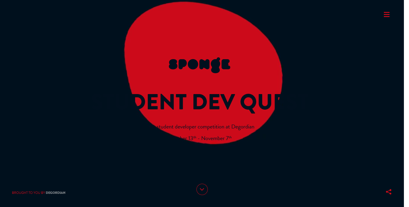
Red
-
Red is a bold and attention grabbing color.
-
Associates with danger, war, energy, strength, power, passion, desire and love.
-
Commonly used to represent danger or an action that have a negative effect. Also red is used to highlight important things.
-
Red can be good for food, fashion, entertainment, sports, marketing, advertising and emergency services.
Pink
-
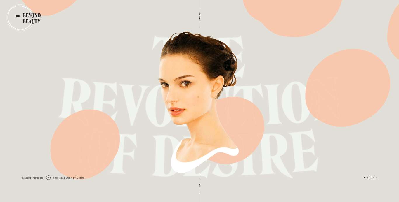
Pink is the color of hope, sensitivity and romance.
-
Associates with youthful femininity and energy,nurturing, selflessness, love and sexuality.
-
An effective color if the target audience is mostly girls and young women.
Orange
-
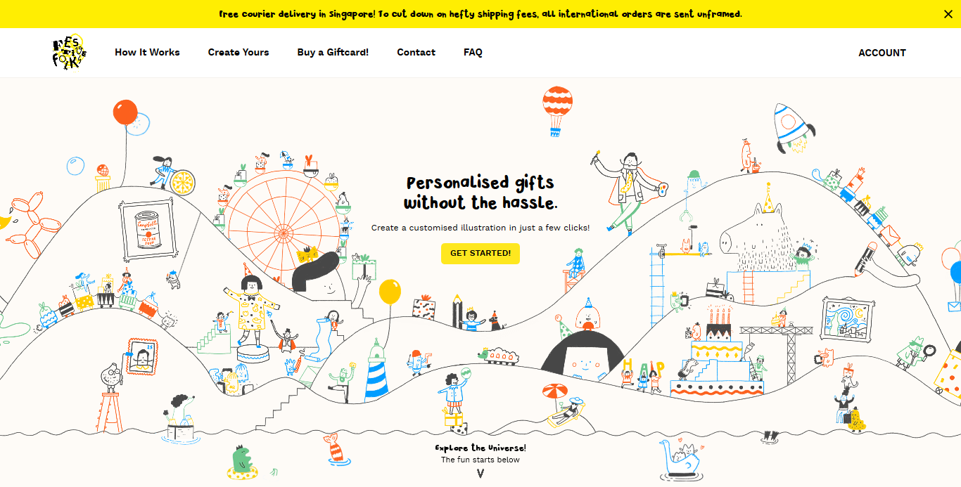
Orange is often associated with energy, positivity, festivity, celebration, food, warmth, security, passion and fun.
-
It is an energetic and warm color which brings feelings of excitement with the combination of red’s power and yellow’s friendliness.

Yellow
-
Yellow is a bright and bold color.
-
Associated with energy, happiness, optimism, confidence, friendliness, creativity and warmth.
-
It is the most difficult color for the eye to take in. When overused yellow may gave a disturbing effect.
Green
-
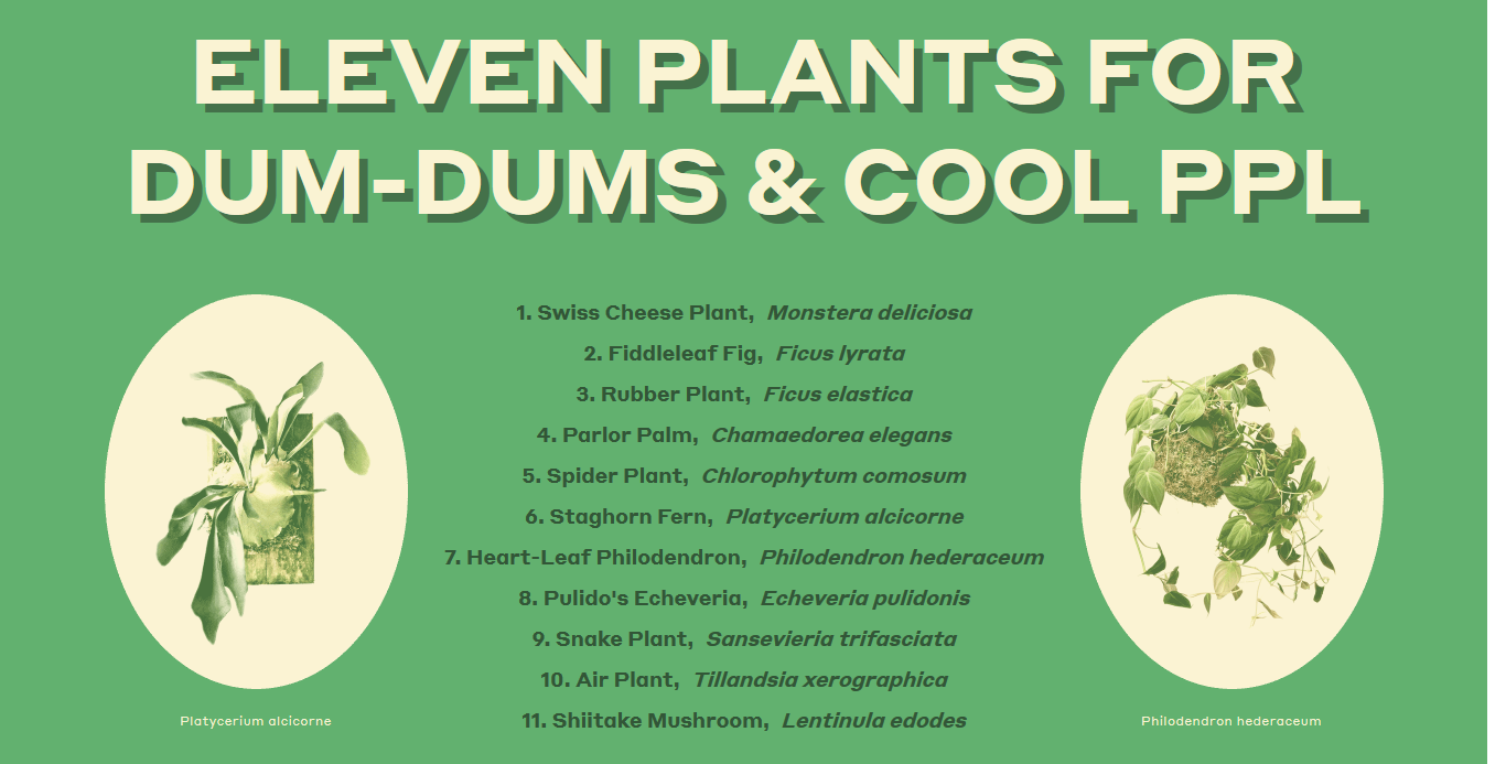
Green is mostly associated with, nature, balance, harmony, comfort, freshness and fertility.
-
Darker shades of green are commonly associated with wealth.
-
It is easiest color on the eye and can improve vision.
-
Symbolizes trust, loyalty, wisdom, intelligence and truth.
Blue
-
Blue is often described as the color of stability and safely.
-
Associated with intelligence, communication, trust, efficiency, duty, reflection and calm.
-
It commonly used for corporate branding since the blue is the color of trust.

Black
-
Black matches with any other color. Because of that it is ideal for the background.
-
Associated with power, elegance, death, evil, mystery and glamour.
-
Black can be traditional modern and serious. But it is depends on how we employ and which colors we use with it.

White
-
White the commonly related with purity and clarity.
-
Associated with hygiene, clarity, purity, cleanness, simplicity, sophistication, light and innocence.
-
Too much white can be cause the isolation and emptiness.
-
White is often used as the background color in design.
Points to consider
-
Make sure your design and its colors convey the right message to the target audience.
-
Choose the colors wisely. They can create huge influence on the users.
-
Some colors may look different on the screens of different devices. So do your own additional testing.
-
Always study your target audience. The color meanings and preferences depend on many factors like age, gender and culture.
References
-
https://tubikstudio.com/color-in-design-influence-on-users-actions/
-
https://medium.com/level-up-web/the-psychology-of-color-in-web-design-dba7df0eb21b
-
https://www.intechnic.com/blog/color-psychology-101-how-color-affects-perception-of-your-website/
-
https://99designs.com/blog/creative-inspiration/psychology-color-web-design/

