Usability Heuristics
By Eashan Rajapakshe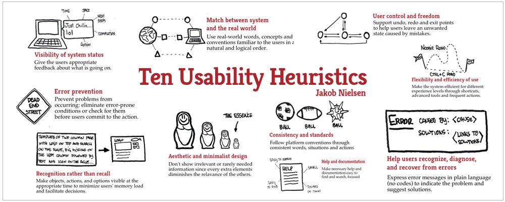
What is usability?
We must first understand usability before we can understand usability heuristics. There are many definitions of usability, but the best one is “ability to use something.” If something is easy to use and we are satisfied with the experience, we say it has better usability. If we can’t use something easily and have a bad experience, we can also identify the thing that doesn’t have better usability.
Components of a usability
- Learnability
How simple are basic tasks for users to complete the first time they encounter the UI design? - Efficiency
How quickly can users complete tasks once they’ve learned the design? - Memorability
When users return to the design after a period of inactivity, how easy can they regain competency as they did before? - Errors
How often do users make mistakes, how significant are these mistakes, and how easily can they recover from them? - Satisfaction
How much fun is it to work with the design? Such as if the interfaces are user-friendly, whether they are clearly visible, and whether there is a clear path to completion, such as vice versa.
UI, UX, & Usability

UI (User interface), UX (User Experience), and Usability don’t provide the same meaning, and they have different aspects when it comes to user interactions with a particular product.
We must use the UX process to obtain information from clients during the initial stage of introducing a new product, adding a new feature to a product, or otherwise revamping the entire product design, by conducting interviews, converting them to prototypes in phases from low to high fidelity, and determining the objectives and goals that consumers demand while building an information architect to a product.
When it comes to UI design, employing design standards, libraries, and other resources, the Aesthetic approach should be utilized to depict the information gathered during the UX process.
However, we occasionally receive complaints from clients who believe that this isn’t essential. We won’t be able to utilize it. This solution features an excessive number of steps for acquiring information. It will occasionally crash during the various types of scenarios. Furthermore, unlike vise, the solution is not appropriate for a large user base.
As a result, we should employ psychological use interactions, as well as usability rules, to bridge the gap between the UX process and UI design and development in order to overcome issues while consuming a particular application we build.
Usability Heuristics
25 years ago, Jakob Nielsen described the 10 general principles for interaction design. They are called “heuristics” because they are broad rules of thumb and not specific usability guidelines.
01 - Visibility of system status
The design should always keep users informed about what is going on, through appropriate feedback within a reasonable amount of time.
02 - Match between system and the real world
The design should speak the users’ language. Use words, phrases, and concepts familiar to the user, rather than internal jargon. Follow real-world conventions, making information appear in a natural and logical order.

03 - User control & freedom
Users often perform actions by mistake. They need a clearly marked
emergency exit to leave the unwanted action without having to go through an extended process.
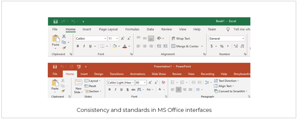
04 - Consistency and standards
Users should not have to wonder whether different words, situations, or actions mean the same thing. Follow platform and industry conventions.
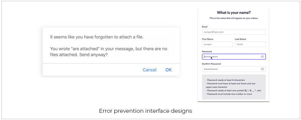
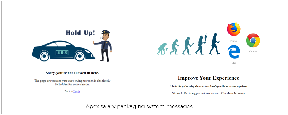
05 - Error prevention
Good error messages are important, but the best designs carefully prevent problems from occurring in the first place. Either eliminate error-prone conditions, or check for them and present users with a confirmation option before they commit to the action.
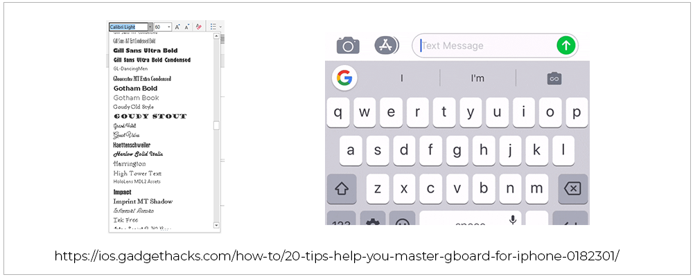
06 - Recognition rather than recall
Minimize the user’s memory load by making elements, actions, and options visible. The user should not have to remember information from one part of the interface to another. Information required to use the design (e.g. field labels or menu items) should be visible or easily retrievable when needed.
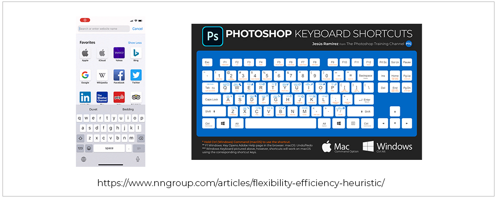
07 - Flexibility and efficiency of use
Shortcuts — hidden from novice users — may speed up the interaction for the expert user such that the design can cater to both inexperienced and experienced users. Allow users to tailor frequent actions.
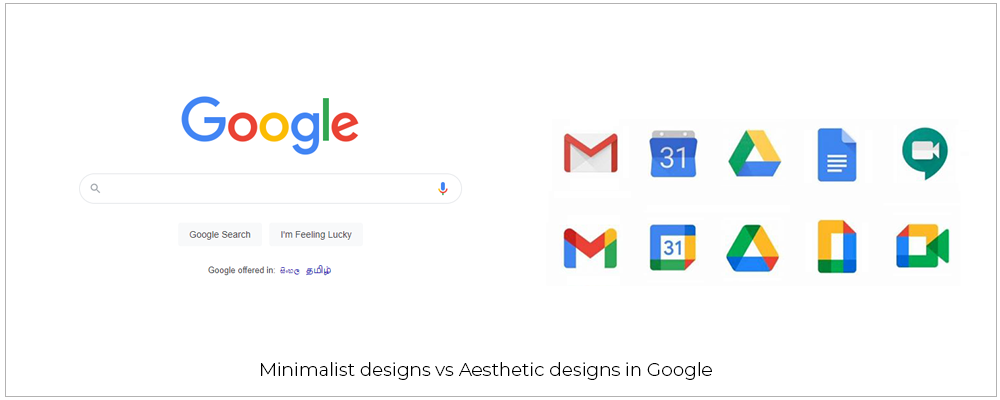
08 - Aesthetic and minimalist design
Interfaces should not contain information which is irrelevant or rarely needed. Every extra unit of information in an interface competes with the relevant units of information and diminishes their relative visibility.
09 - Help users recognize, diagnose, and recover from errors
Error messages should be expressed in plain language (no error codes), precisely indicate the problem, and constructively suggest a solution.
10 - Help and documentation
It’s best if the system doesn’t need any additional explanation. However, it may be necessary to provide documentation to help users understand how to complete their tasks.
References
-
Nielsen Norman Group
https://www.nngroup.com/articles/ten-usability-heuristics/ -
UX Collective
https://uxdesign.cc/10-usability-heuristics-every-designer-should-know-129b9779ac53 -
Business Config
https://businessconfig.com/en/blog/how-to-improve-web-usability/