UX enhancing design layouts (The Z-pattern and the F-pattern)
By Eashan RajapaksheUser experience (or UX for short) is one of the key defining features of any software application. Most people tend to think that UX is the same thing as UI, but this is not true. UI, or User Interfaces are just the pages that a user will come across when using a software application. However, UX goes far beyond that and deals more with how a user actually works with an application rather than just how he/she views the application. Be it web, mobile or even desktop applications, the availability of a more smooth and streamlined control flow for the user of the application to pass through helps to get things done more quickly and accurately. In addition, the most important thing is that the user is motivated to use the application again. Bad UX, on the other hand, always results in the user finding it more complicated to do what he/she intends to do, and therefore will not want to use the application again.
When it comes to designing proper UX, the key is to keep the user engaged at all times. For this, a number of different techniques are adopted in modern software. In a mobile app, for instance, special care is taken to ensure that the main functionalities and the most commonly used workflows are always available within the user’s range of touch. There are special charts which illustrate this in more detail, but that is a topic for a different article. Instead, we will discuss a more common feature for all of desktop, web and mobile applications. This would deal with the user’s eyes rather than his/her sense of touch. To elaborate, this is how the user’s eyes will move across the screen when he/she is viewing a page, or a User Interface (UI) of the application. According to research, certain patterns can be predicted, by which we can enhance our applications by structuring the pages to make use of these regions where the user’s eyes visit the most.
There are three most common design layout patterns when it comes to taking advantage of how people scan or read through a design. Out of these, we will discuss the basic two patterns, namely the F-pattern and the Z-pattern. The third one, which is the “Gutenberg Diagram”, is a more complex layout which is used mainly for text-heavy pages, and can be discussed in a future article .
The Z-pattern
In most Western cultures, text is read from left-to-right and up-to-down. The Z-pattern uses this concept when arranging different elements in to the structure of a webpage. The human eyes follow this pattern mostly on pages that have large colorful and attractive graphical elements. The Z-pattern works better for looser, sparser websites and for specific pages such as dashboards, landing pages, home pages, etc.
The below diagram illustrates the route of the eye’s focus when scanning through a page following the Z-pattern:
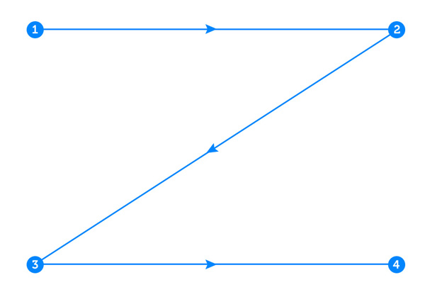
Source: Tutplus; https://webdesign.tutsplus.com/articles/understanding-the-z-layout-in-web-design--webdesign-28
Starting from point 1 at the top, the user scans from left to right in a horizontal line, to point 2. Then the eye goes down and to the left side of the page to point 3. This is mainly due to the reading habits of most humans. Again, from left to right in a horizontal line, the eye will scan through the page to point 4. This ultimately will form an imaginary shape like the letter Z.
Consider the following sample webpage:
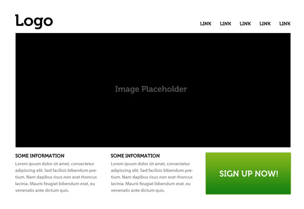
Source: Tutplus; https://webdesign.tutsplus.com/articles/understanding-the-z-layout-in-web-design--webdesign-28
It has different elements such as a logo, top navigation bar with links, a large graphical element in the middle, and some other content below it. Such a page is ideal for demonstrating how the Z-pattern works.
Next, let us look at how the page is read according to the Z-pattern:
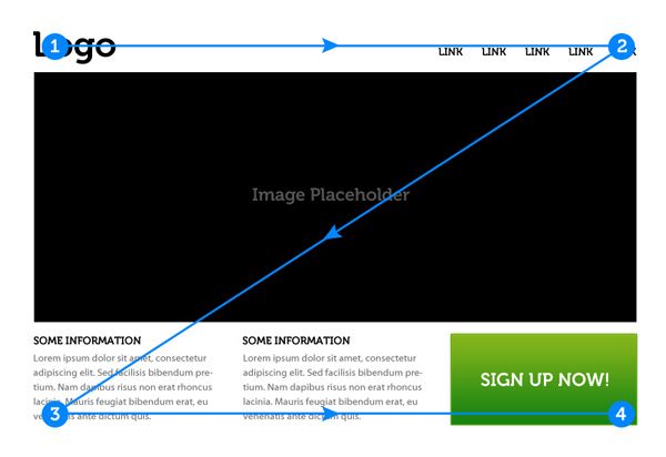
Source: Tutplus; https://webdesign.tutsplus.com/articles/understanding-the-z-layout-in-web-design--webdesign-28
The numbers in the above diagram indicate the path that the eye follows along the page, as well as being points of interest in the overall page.
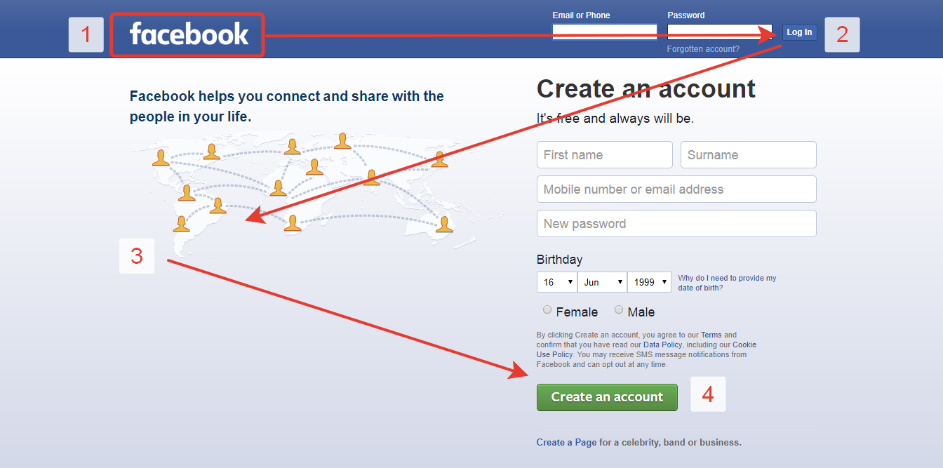
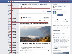
A good example of the Z-pattern in action is the Facebook landing page, which is shown below.
The F-pattern
The F-pattern is different from the Z-pattern in that it is more suitable to consider in a page that is heavy in text and content.
Consider the diagram below, which shows the heat-maps from user eye-tracking studies of three websites:
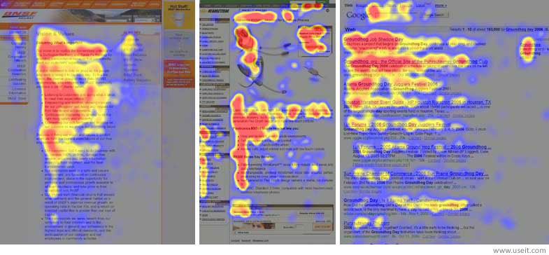
Source: Nielson Norman Group; www.nngroup.com/articles/f-shaped-pattern-reading-web-content/
The above heat-maps show how users read three different types of webpages: the “about us” section of a corporate website, a product page on an e-commerce website and a search engine results page. The areas where users looked the most are colored in red, the areas with fewer views in yellow, and the least-viewed areas in blue. Gray areas indicate that they did not attract any views.
If you look closely at the patterns on all the pages, you can observe that they are all relatively similar to the letter E or F. Hence this type of reading/scanning pattern of the human eye is commonly known as the F-pattern. Any page filled with rows of content would ideally fit the description of this design layout pattern.
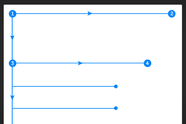
The basic characteristics and flows of the F-pattern are shown in the following diagram:
Source: Tutplus; https://webdesign.tutsplus.com/articles/understanding-the-f-layout-in-web-design--webdesign-687
Similar to the Z-pattern, the users eye starts at the top left, at point 1, and moves in a horizontal line to point 2. But then, because there is a similar row of content under that instead of a large picture or other such graphic, again the eye moves down to point 3, and performs a similar horizontal action to reach point 4. This procedure is repeated continuously so that the path resembles either a letter F or E.
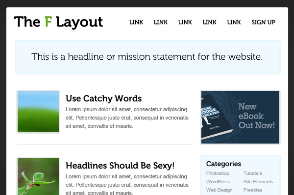
Now, as we did before with the Z-pattern, let us consider a generic web page to best demonstrate this pattern:
Source: Tutplus; https://webdesign.tutsplus.com/articles/understanding-the-f-layout-in-web-design--webdesign-687
The above page has similar characteristics to the webpage that we considered for the Z-pattern, in that there is a logo/website name, navigation bar with links, etc. But the difference here is that instead of having a large element of graphical content, there are rows of content which contains both text and graphics. But the structure of the rows is very obvious and easy to distinguish.
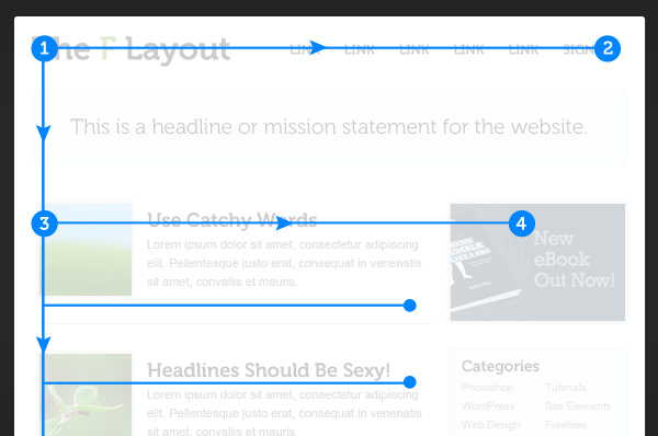
Due to this layout, it is a good example of following the F-pattern, which is shown below:
Source: Tutplus; https://webdesign.tutsplus.com/articles/understanding-the-f-layout-in-web-design--webdesign-687
Again, the numbers in the diagram indicate the path that the eye follows along the page, and points of interest in the overall page.
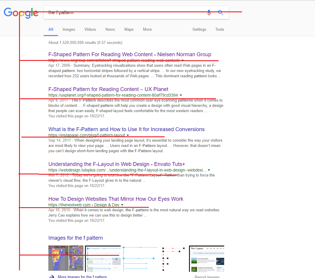
A popular example of the F-pattern in action would be a Google search result, or even the Facebook newsfeed, which are 2 of the most visited pages in any internet user’s day to day life.
So it is clear that by following such design pattern layouts, we can take advantage of a user’s eye movements in order to structure a webpage to be more user-friendly and interactive. This results in the overall website exceeding expectations in terms of user experience (UX).
References
http://www.creativebloq.com/ux/how-human-eye-reads-website-111413463
https://thenextweb.com/dd/2015/04/10/how-to-design-websites-that-mirror-how-our-eyes-work/
https://www.nngroup.com/articles/f-shaped-pattern-reading-web-content/
https://uxmag.com/articles/the-f-pattern-understanding-how-users-scan-content
http://www.creativebloq.com/web-design/design-jargon-explained-z-pattern-71515717
https://uxplanet.org/z-shaped-pattern-for-reading-web-content-ce1135f92f1c
https://uxplanet.org/f-shaped-pattern-for-reading-content-80af79cd3394
https://webdesign.tutsplus.com/articles/understanding-the-z-layout-in-web-design--webdesign-28
https://webdesign.tutsplus.com/articles/understanding-the-f-layout-in-web-design--webdesign-687